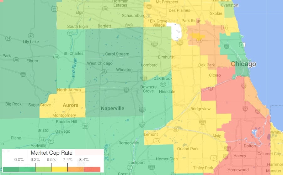
Cap rate spreads aren’t as black-and-white as they seem. You can rattle off a national average, but speak to any investor in a fast-rising market or a quiet small town, and you’ll get wildly different takes on what those spreads really reveal. So let’s roll up our sleeves and dig into why analyzing these differences actually gets you ahead.
The Illusion of the Average: Why Cap Rates Defy Simplicity
In commercial real estate, averages rarely tell the whole story. Whether you’re tracking real estate market trends or evaluating risk, national numbers often overlook the nuances that impact actual investment decisions.
Cap Rates: A Benchmark, Not a Rule
Cap rates help monitor general motion, but the real signal is in how much they vary. Those variations—between markets, property types, and asset classes—are where insights and returns often lie.
“It’s a useful piece of information for monitoring general trends, but it most certainly is not the end of the road.”
Investor Perspectives: Context Is Everything
Ask investors in New York vs. Kansas City about “normal” numbers, and you’ll get a range of answers. A 6% rate might seem high in a big city and low in a smaller one. That variance is shaped by local experience and economic conditions.
Property Class and Capital Flow
Consider the gap between
- Class A, primary market: ~4.7%
- Class C, tertiary market: 7.2%+
That 250+ basis point spread isn’t theoretical—it’s real-world investor calculus.
A Window into Opportunity (and Risk)
Cap rate variance reflects more than pricing. It highlights opportunity and potential volatility. Wide gaps can mean untapped potential or underlying risk. Narrow ones might suggest market maturity—or stagnation.
Spreads Across Markets
From primary to tertiary cities, real estate performance diverges sharply:
- Primary: 4.7%–6%
- Secondary: 5.8%–6.4%
- Tertiary: 6.6%–7.2%+
Capital tends to flow toward higher returns—until risk says otherwise.
Class Distinctions
In one metro, a Class A asset may see a 4.7% return, while Class C goes over 7.2%. The difference stems from investor confidence, location, tenant profile, and lending appetite.
Cap Rate Ranges by Asset Type
Different sectors, different dynamics:
- Office: 4.6%–10.5% (Avg. ~7.4%)
- Retail: 5.9%–8.5% (Avg. ~7.4%)
- Industrial: 5%–8.1% (Avg. ~6.9%)
- Self-storage: 5%–7.5% (Avg. ~6.5%)
- Hotels: 6%–11% (Avg. ~8.6%)
These wide ranges reflect the complexity of each asset class.
What These Differences Reveal
Cap rate shifts aren’t just academic. In multi-family, rates jumped from 4.1% in 2021 to 5.2% by 2024. That change affects property values, financing terms, and investor expectations across the board.
Beyond the Data: Local Analysis Matters
National averages give a general sense, but granular market analysis unlocks real value. Look closely at economic drivers, capital flows, and property specifics to uncover hidden opportunities.
“Use a shovel, not a rake, when you’re digging for insights.”
National averages give you the overview—but it’s the gaps between them that help investors make smarter moves.
Source: https://www.linkedin.com/feed/update/urn:li:activity:7337876988893839360/
Receive Market Insights
Periodic analysis on rents, pricing, cap rates, and transaction activity across Chicago and key suburban markets.


